Choosing a baby name can turn into a surprisingly large data problem. Lillenaam started as a small app for an Indian family expecting a baby girl in Denmark: a way to browse names, compare their meanings and pronunciation, and let friends and family help make a shortlist.
The project is now an open-source template built with Next.js, TypeScript, and Firebase. Its name list and branding can be replaced for another family or country.
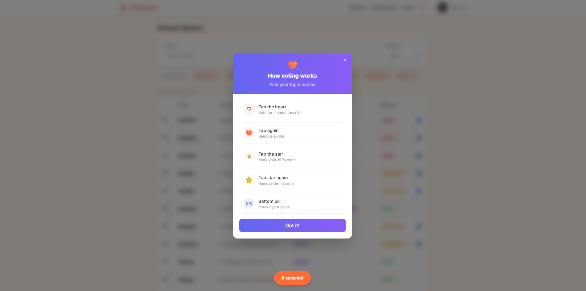
First-time users see this voting guide, which explains how to select names and mark a favourite.
From a registry to a shortlist
The repository README documents this workflow:
- Collect the girl and unisex names from Denmark’s published approved-name registry—roughly 26,000 names in the project’s source dataset.
- Use Gemini Flash to enrich each name with an origin, a Hindu classification (
YES,MAYBE, or no), a short meaning, and a Danish pronunciation difficulty rating with notes. - Filter the enriched list to Hindu or Hindu-sounding candidates, producing the 2,655 names bundled in
hindu_names.csv. - Import that CSV into the app, where family and friends can browse, filter, and vote. The published template allows five picks and one favourite.
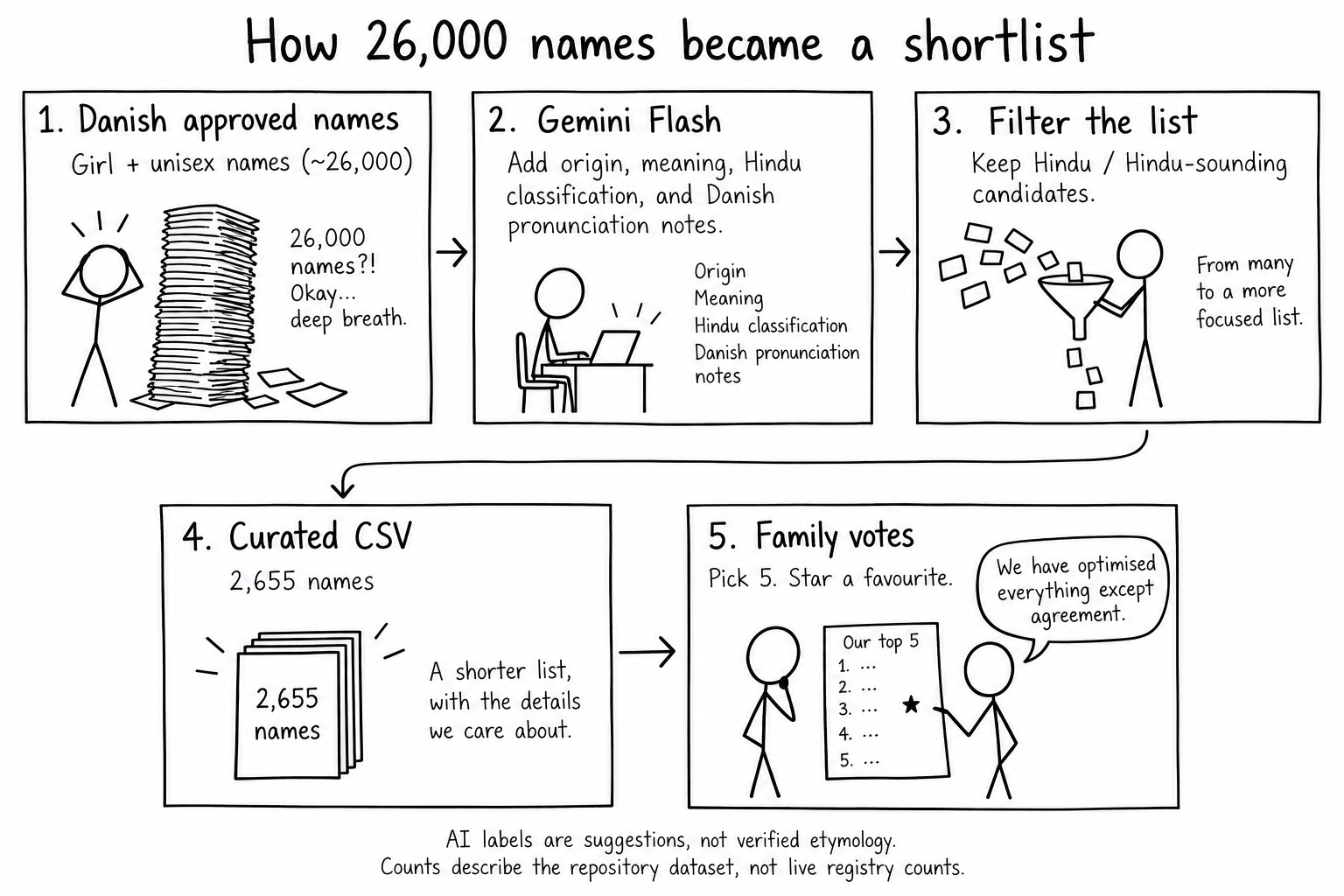
The counts describe the repository dataset, rather than today’s registry. The AI-generated meanings, classifications, and pronunciation notes are browsing aids, not verified etymology.
The app in use
These screenshots show the app with Naamam branding. Its visible name count and selections differ from the published Lillenaam template described above.
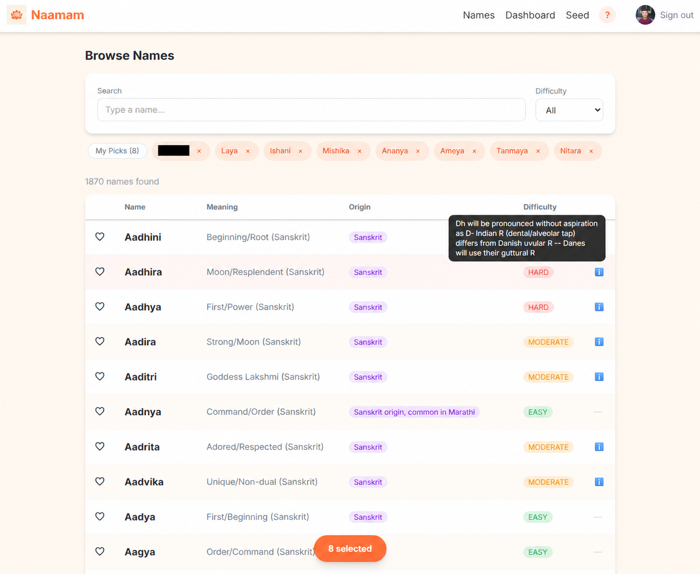
The name browser brings meanings, origins, and pronunciation notes into one place. Hearts collect a shortlist, while difficulty notes explain potential pronunciation differences.
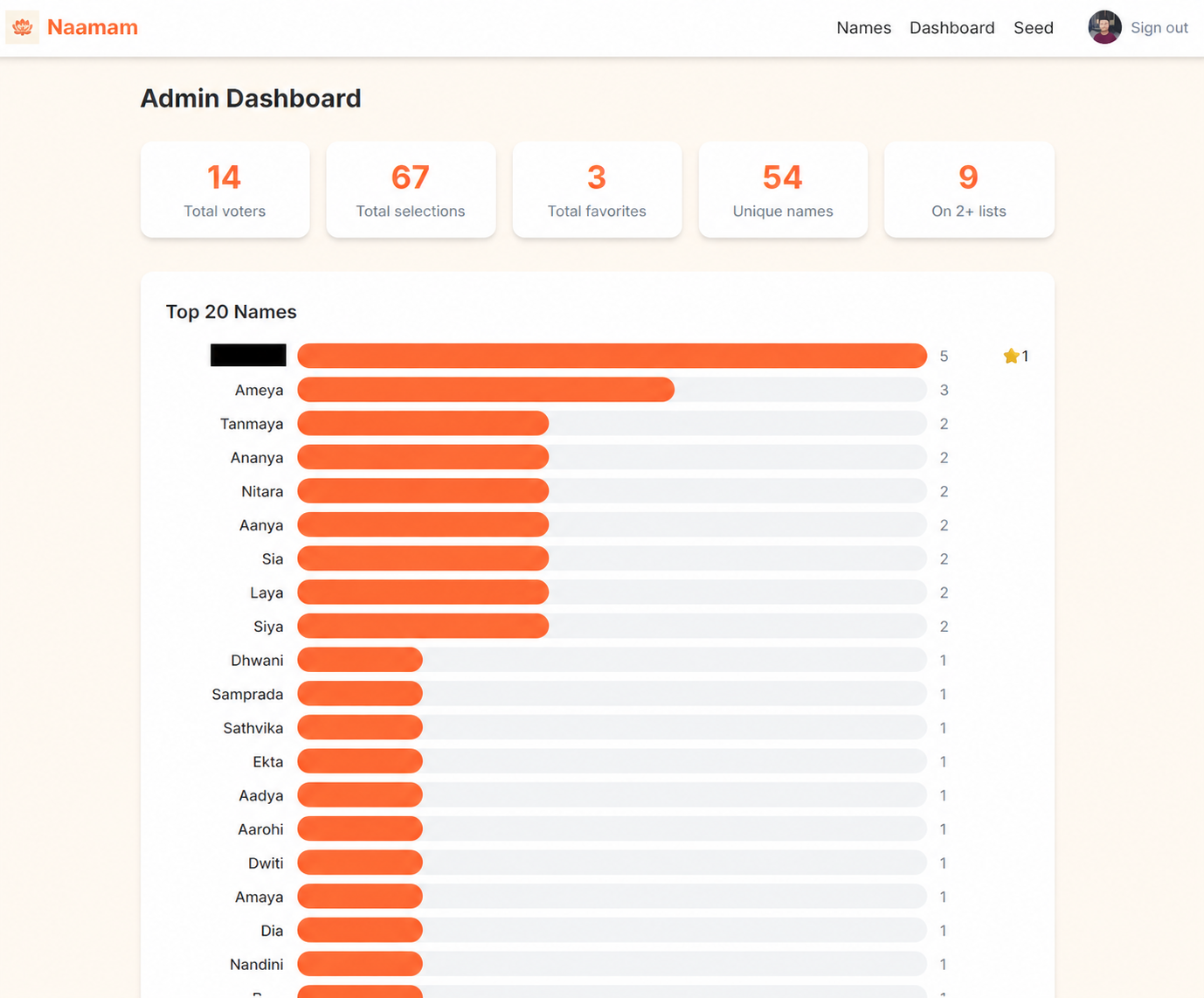
The dashboard shows which names attract votes and where different shortlists overlap. It makes the family’s preferences easier to compare—without pretending that the final choice is an optimisation problem.